By Eric Van Buskirk
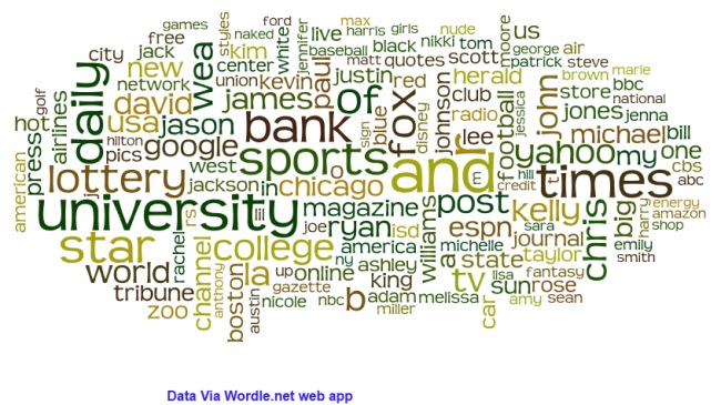
I’ve used Wordle.net, an online application, in the past for visualizing word frequency. Today I had great results using it with data from SEMrush. What you see is the from the top 10,000 SERP for Twitter.
That is, the 10,000 search phrases searched in Google that drive the most traffic to Twitter, but broken into individual words that each “count” separately. Wordle then finds those recurring the most to “paint” its image. For “% 0f Traffic from Google Search” you are seeing how much of all search traffic to Twitter is accounted for by people clicking on that one SERP. These percentages are based on the traffic SEMrush tracks, which comes from the 110 million keywords they are constantly monitoring. The percentages look low, but keep in mind that this is only 10 of the 10,000 used in the word cloud, and that Twitter has millions of mid and head keywords that drive traffic. I excluded “twitter” “and” “news” because they overwhelmed all the others with their huge frequency. What amazed me was “university” followed by words like “sport” and “times” were the highest represented traffic drivers. Who knew? Remember Google indexes account names, not tweets or trending hashtags.
| % of Traffic from Google Search | Keyword | Position in SERP | Searches Per Month | Landing Page |
| 0.66 | netflix | 4 | 24900000 | https://twitter.com/netflix |
| 0.66 | cnn | 4 | 24900000 | https://twitter.com/cnnbrk |
| 0.63 | 13 | 185000000 | https://twitter.com/google | |
| 0.57 | hotmail | 7 | 37200000 | https://twitter.com/hotmail |
| 0.47 | cnn | 5 | 24900000 | https://twitter.com/CNN |
| 0.45 | lowes | 2 | 9140000 | https://twitter.com/Lowes |
| 0.31 | target | 5 | 16600000 | https://twitter.com/Target |
| 0.31 | aol | 7 | 20400000 | https://twitter.com/AOL |
| 0.29 | wells fargo | 11 | 16600000 | https://twitter.com/WellsFargo |
| 0.26 | fox news | 5 | 13600000 | https://twitter.com/FoxNews |
| 0.25 | tmz | 3 | 7480000 | https://twitter.com/FoxNews |
| 0.23 | msn | 10 | 20400000 | https://twitter.com/MSN |

